Pages

Sunday 27 February 2011

Portfolio Wireframes.

In our design seminar for the Digital ME project this week we learned about wireframes and produced some for our ideas for our website pages. I did 5 possible page layouts using Photoshop to produce my pretty basic wireframes. Here they are so far...


 I would keep a similar layout between the pages to improve continuety within my website, but would possibly change the background image between each page to give it more of a creative interest, rather than making the audience too bored by seeing the same image over and over again. I could also carry this on by changing the colours of the images or backgrounds slightly too.


 (I would have uploaded these earlier but my laptop seems to be slowly dying from malware or something. typical hm? D: i shall sort it)

Thursday 24 February 2011

Examples of websites I like...

In preparation for designing my own portfolio website, I have looked at websites of music artists I am interested in and commented on their style and layout.

Florence + the machine:


 I really like the variety of manipulated photography, images, videos and blog in this design. I also really like the darkness of it and how the photograph of the "lungs" makes it seem more 3D. I also chose to look at this website because of the use of pieces of paper in her layout. This is something I would like to do to make my website less typical.


 Kate Nash:


This website is much more wacky and unorganised in style, but uses a lot of hand drawn imagery and text (as well as html typography too) which is another quirky feature I would like to experiment with in my designs. However, I feel the layout is too random and confusing in this example and would prefer all the text to be aligned to the left.

Andy Love's blog:


In my seminar, Shaun recommended I looked at one of our 3d animaiton lecturers' blogs on the refelective journal website as research on websites associated with my preferred pathway (VE). I like how he has used simple scribbles as a main background rather than a possibly distracting photograph or boring colour background. This is something I would like to try in my own designs. I also like how it mainly uses only black and white, to fit in with this sketches and work shown throughout the webpage.

Saturday 19 February 2011

Interactice Media Project - Digital Me.

This week we have started our new project for DP2 - Digital Me. For this we will produce our own website portfolio using HTML and CSS on Adobe Dreamweaver (CS5).

One of my first tasks was to produce a quick moodboard of my interests and things that represent me well. This includes both images and typography - important factors of web design!

Here is my moodboard so far. It looks a little blank, but hey, I think it is about done. :)


I've featured obvious things like my name, interests using different fonts and imagery I like. I have also included main themes such as games, music and fashion that I like outside of my university life. Little Big Planet 2 is something I very much like at the moment so this has a reasonably large section in the corner of my moodboard. Same for my first car in the opposite corner :D

We have also learned some basic HTML and CSS styling on Dreamweaver with Giselle. I found this pretty darn easy to be honest, I guess it is going to get a bit more stressful when we start to produce our designs. I will try and practice as much as possible to ensure I can do as much as I want to when the deadline gets closer, although I am trying to practice animation in preparation for that project too as that is my main interest! (Struggling :( boohoo.)

I am finding this project pretty interesting so far, probably due to me coming from a graphic design background and I have done a project very similar to this before, but I only did mock ups and did not actually produce the a functioning site, so this should be fun! :)

Thursday 17 February 2011

Interactive - David Shrigley Portfolio

http://www.davidshrigley.com/index.html


This website uses a lot of handwritten navigation and titles throughout, which fits in with his style of drawing, animation, etc. This could also be a disadvantage in some sense as it could be difficult to read or become quite unclear where to click, etc.


I like the simplicity of just using black and white on the main pages of the site which is well contrasted and usually clear for the audience to navigate and read through. The way it is just the image/illustration and text to describe it all above a link back or to the home page is also simple and effective. This use of links at the bottom of the page could be a method of making the user look at the whole page, therefore can be quite frustrating.

Tuesday 15 February 2011

"Ticket" Group Edit & Moving Image Evaluation


"Ticket" Group Edit from Samantha Freeman on Vimeo.

For this Moving Image project, the theme was “Interpretation”; where we were given a script and had to interpret it in our own way to produce a short film. My group consisted of me, Charis, Alyssa, Stephie, Alex and Lauren, and we were given the script called “Ticket”. We were also given roles straight away for our film crew – my role was the editor.
From reading the script we decided to base our film upon the main genre of romance, but did not want to make it typical to films seen so often in cinema today. To make ours different, however, we eventually decided upon a theme of 1960s French romance film, influenced by Jean-Luc Godard’s New Wave film “Breathless" from 1960. We analysed the use of black and white, tone and music within clips from the film and tried to reflect similar techniques in our own edit.
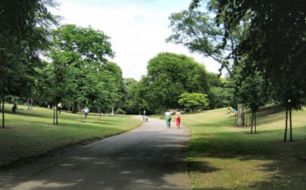
Before any of this, there was a lot of planning and pre-production to be done before we could start filming. We overcame quite a few problems regarding risk assessment of location, as our planned location was either a bus or train station. We decided that it would nearly impossible to gain permission to film in such places, so compromised by filming in the Arboretum park nearby and using references of the tram and a tram ticket instead. Although this wasn’t original to the script and was considered a compromise at first, I think this was overall a successful piece of interpretation and adaptation of our script and shows problem solving to a reasonable standard.
We also had problems regarding organising actors, due to both male and female actors being unavailable at the last minute. We solved this by our director asking a male friend to help us out, and we ended up having our director, Alex, as our female actor in the end. Although this wasn’t ideal, I feel that using costume and props, etc. we were still able to convey the narrative and style quite well considering our actors were not professional.
However, I feel our two filming sessions went rather well and we got everything done relatively sufficiently. Our first filming session in, week 4 of our 5 week rotation, wasn’t as successful as we had hoped though, as we realised we didn’t get as many successful shots as we may have liked, so organised a final filming session within week 5 to ensure we had enough shots to edit together. I feel this is where we had some problems with team work due to a few members of our crew not turning up or contributing as much as we may have imagined they could.
As the editor, it was mainly my responsibility to cut all the shots and put them together into our film. As our style was 1960s romance, I also had to make each shot black and white, which made rendering a lot more tedious, but I feel it is worth it now the edit is uploaded. We also used a variety of quite obscure camera angles and shots that would not conventionally be put together, giving the film a more abstract, quirky style to fit in with our chosen genre.
I also feel we had some lack of team work during editing as it was mainly me and Alyssa (sound and production design) who stayed behind to edit our film, whereas the director did not get as involved as may have been necessary in a real film production team. Despite this, in our circumstances, I think there was sufficient effort from most of the crew, considering our director also took on the role of the female actor.

Friday 11 February 2011

Last Film Seminar

Was today!

We got some feedback and tips from Deborah on how to improve our story and scene transitions, etc to enhance our film for the audience. However, we also had positive feedback on use of filmed title sequence using the ticket style - which was nice to here to be honest. :)


I ended up staying behind for a few hours as well as starting early, and our film will still not export to a film file. Not good. We need to try and do it again on either Monday or Tuesday so we can upload it onto vimeo for our deadlines. However, we have pretty much finished our edit to the best we feel we can in our time limit. We improved the story by adding more faded in/out scenes to explain what was happening between the main scenes throughout the script and how we interpreted how it would turn out.

I will upload our film edit and evaluation as soon as I possibly can. Premiere Pro is not the most friendly software in the world to me! (It broke on my laptop literally yesterday. Bad timing.)

Tuesday 8 February 2011

Film update time D:

It is getting very stressful and last minute now we are into the final week of producing our "Ticket" film interpretation. We were going to record any extra shots and sounds we need to enhance the rough edit I have thrown together so far. We filmed the main bulk of our footage last Wednesday using Tim as the actor for Sam and Alex as Lisa's character, due to a last minute cancellation by our initial female actor.

We will try and gather all extra footage by tomorrow so we can start editing what we have so far to increase its quality and style as much as possible. Our main influence is a 60s French film called Breathless by Jean  Luc Godard.


The main aims from this influence is using a black and white style and jazz-style piano music at appropriate times throughout. We could also discuss using subtitles to give a similar style, but instead of translating in subtitles, we could put what the character is truly thinking. We will consider this if we have time.


Here are some photographs I took on my iPhone on the main day of filming last week.


As you will see we were using some quite complicated unfamiliar equipment. We did this to improve the potential quality of the sound - we could only use a boom mic with the professional camera. We still did struggle with this equipment and found the windy conditionals still affected our sound slightly in some places, but think it was better quality that it would have been with the domestic HD camcorders. We may have sacrificed some of the image quality by setting most settings to automatic on the complex camera but I feel the quality is acceptable and can be enhanced with tools on Premiere Pro when I start to add more effects this week.

Tuesday 1 February 2011

Location confirmation - risk assessment done!

We have had our risk assessment checked and confirmed bhy Deborah - The arboretum park.
We will be filming tomorrow from about 1pm until whenever we feel we have enough shots.
We also apparently now have 2 actors again thanks to Alex ;D so hopefully should go smoothly once they get their head around the characters and script. I guess we will do shorter shots to decrease the amount of script learning for the actors.

Here are a few pictures I found of the location: