Pages

Sunday, 24 February 2013

Artefact 3 Evaluation & Outcomes

Artefact 3 - 'Worn Out'

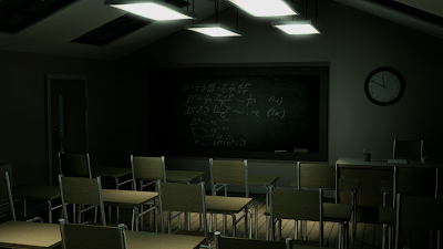
The aim of my third artefact was to experiment with texturing techniques in order to give a certain atmosphere and feel to my classroom scene. The atmosphere I had chosen to try to achieve was a derelict, used, uncomfortable atmosphere, to add to what I had achieved in my previous artefact of an eerie mood.

This time, mainly due to time restraints involved with texturing, I decided against producing an outcome early to gather feedback from an online survey, and instead put my time into my texturing and get detailed feedback in my tutorial focus group. Also due to time restraints, I made the decision not to unwrap objects in the scene, but instead used the UVW map modifier to create a similar effect with some of the graffiti and grunge maps in my textures.

In my presentation, the main constructive feedback I got from my tutor and peers, in terms of texturing, was that unwrapping objects could improve the effect of some of the textures, making them seem more realistic and less tiled. Some other general suggestions were to enhance edges with ambient occlusion, experiment with different colours of furniture and light for more contrast, and that camera angles and composition could improve the effect of an uncomfortable atmosphere further.

However, the feedback for this artefact was mainly positive, with many saying that the overall quality of my work had improved vastly since some of my earlier projects and artefacts. I also feel that this is the case, with attention to detail in textures and more thought going into my lighting making the overall outcome much more aesthetically successful.

Due to both feedback during my presentation and responses to my previous survey, I have chosen to focus on camera techniques in artefact four. The main techniques I will initially experiment with will be camera angles, shots, and depth of field. I could then take this further in my final artefact, including camera movement and editing skills to create a final video outcome.

Edited renders:


Textures created in Photoshop (using grunge maps, typography, etc.) :


Wednesday, 20 February 2013

Castle Modelling - Almost Done!

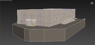
I have modelled practically all of the main body and detail for my part of the Castle Attack client project now, trying to follow the instructions given by Simon to the best of my ability. It still has a LOT of faces (triangles) to be honest - about 22,000 for my parts alone. I will therefore suggest a total limit for the whole scene to be about 40,000 faces, as the suggestion we were given was 30,000-50,000.

Here are some renders/screenshots of my (almost final) model for this project...


From now on, I will look into the texturing process that we need to follow, and begin to work on this part of the project. Hopefully it won't be as time consuming as it seems! 4 weeks to go!

Friday, 15 February 2013

Artefact 3 Plan - "Worn Out"

For my third artefact I will be focusing mainly of the technique of TEXTURING. My primary aim is to produce an atmosphere for my environment to make it feel worn and derelict. Although I have found that lighting can add mood to the room quite effectively, I have also discovered that other techniques, such as more detailed textures, can give much more feeling to a CG environment for the audience.

Keywords for this artefact:
  • Worn
  • Used
  • Derelict
  • Abandoned
  • Vandalised
  • Old

These have given me the following initial visual research for this artefact...

Texture Examples


Photographer - Jeff Wall


Examples of Graffiti/Vandalism in Interiors


Examples of CG Environments with Derelict Feeling


As well as looking at the textures used in these examples I have found, it is also worth noting the positioning of objects to add to the effect, such as hardly any furniture in place, and things not looking as tidy as they would in a newer, in-use environment.


Wednesday, 13 February 2013

Castle Stuff..

Despite not receiving any feedback on modelling techniques and polygons/triangles yet, I have now modelled most of the detail on the main east front wall of the castle building, using the technique I think most appropriate. It does use A LOT of faces in terms of counting "triangles" (maybe like 12000 total for the wall) with the Polygon Counter tool, so I am hoping we should be counting polygons instead now as it would be half this amount! Haha. :)

Anyhoo, here are some screenshots and renders of the wall so far and of a quick merge with the previous file...


Tuesday, 12 February 2013

Artefact 2 Evaluation

Final Outcomes:

Main outcome: Green tint with moderate saturation levels

Extra outcome: 'Film Noir' style with no colour and high contrast


The main aim of this second artefact was to explore lighting and colour-correction techniques in order to create an eerie, uncomfortable atmosphere for my classroom environment at night. From my research, I decided to experiment with both colour and the genre of ‘Film Noir’. Once again, I decided to use a combination of an online survey (using other students on my course) and my focus group to gain feedback on my experiments.

The feedback I received from the initial survey was quite widespread in terms of people’s opinions on the colours and effects; therefore finding one method to use for my outcome was quite tricky. For instance, only one or two more people preferred my experiments with lower saturation levels, and only a few more seemed to prefer my green tinted imagery to the blue. However, from observing the results to the best of my ability and using some personal views, I decided on a compromise between the high and low saturation levels of the green version, due to a small margin preferring this colour.

In my focus group, however, both my tutor and one or two students suggested that the blue could be more effective if I improved other areas, such as light quality, shadows, and camera angles. It was also noted in this feedback that extra lighting, such as upward lighting, could be considered if I wanted to create a more eerie effect, which is a technique used in many films to create this mood, such as Tim Burton’s Corpse Bride.

Once again, I have realised that people can have very differing opinions on colours in association with mood, but also that colour isn’t always needed to add mood to an environment, as showed by the ‘Film Noir’ style of film. Also, as an additional question on my survey, I asked which techniques would enhance the mood more, and the most popular answers were texturing and camera angles, therefore these will be the techniques I explore in more detail next, starting with texturing.

Monday, 11 February 2013

'Castle Attack' progress - merging files etc.

Last week we decided to merge all of our models so far of the basic shell of the castle in 3ds max, to see if everything is working as planned and fitting together nicely. :) It worked pretty well actually, so we decided to e-mail Simon as he had requested us to in our first week or two of modelling to keep an eye on what we are doing. I still haven't had a reply, but am waiting on it!

Here are some screenshots I got of mine and Amanda's models merged together in one Max file:


I have also just experimented with importing this geometry into the 'Unity' game engine software - to be honest I really don't understand this software, all I can do in it is literally import and view the models. I did it with both an FBX file and OBJ file, which both seemed to work okay, although the FBX file contained materials, but seemed to be very laggy in the viewport.

FBX file imported into Unity

OBJ file imported into Unity

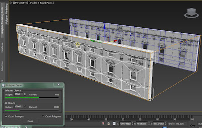
At the weekend, I also had a go at modelling the rather detailed window frames from the East Front wall, discovering that it is very hard to produce the whole object in low poly! For instance, my first attempt was the example below, which only just has less than 1000 faces when counting triangles with the polygon counter (I think this is the tool we need?).

First attempt - too many polys?!


I have now had a second crack at it, editing my previous version, removing edges and vertices along the way, and have now managed a lower poly version amounting at 660 faces using the came method of counting. This is still a lot for 1 window frame, but I guess that they aren't all quite this detailed.


Thursday, 7 February 2013

Progress on Artefact 2 :)

This week I have been experimenting with lighting again with my classroom scene, this time to create an atmosphere of an eerie night. So far, from using my previously posted reference images, I have decided to use photometric lights with a greenish/blueish tint (filter) to create the desired effect. I have also made some slight adjustments from feedback I received during my presentation for artefact 1, such as the time shown on the clock, slight bump maps on the walls, consistent backgrounds shown through windows.

Here are some renders I have edited in After Effects and Photoshop, experimenting with different colour tints and saturation:

Experiment with green tint - highly saturated

Experiment with green tint - desaturated

Experiment with blue tint - highly saturated
Experiment with blue tint - desaturated


So far, I think that more desaturated versions tend to show an eerie/uncomfortable mood more successfully, and also think that the green tints work slightly better. However, I will probably post these pictures onto a quick survey again to ask some simple opinions on them.

In order to investigate the role of colour when creating mood, I will also include a version which is almost totally monochrome from desaturation, to see if colour makes any difference or is actually needed to create this type of atmosphere. I have looked at film noir quite a lot during my initial reading into my research question, and this is a good example of how lighting can be used to enhance the atmosphere of the horror genre without any use of colour to influence this.

Experiment with hardly any colour saturation at all - Film Noir style

Wednesday, 6 February 2013

Modelling the Castle Walls

During my first week of making work for this client project, I planned to produce the main geometry of the 3 castle walls I have been allocated, which I think I have successfully completed. I have modelled each side of the building as a separate model for now, and will probably attach them later on if this is required. I have also checked the main wall measurements after Amanda informed me some were slightly off, therefore altered them as needed. I think I am going to email my progress so far and any questions I have to Simon (Hot Knife) tomorrow before or after meeting for tutorial, as he is in charge of the technical side of the project.

Anyway, renders/screenshots of the model so far!


Model with wireframe overlay (North Front end)


Model with wireframe overlay (South Front end)


Monday, 4 February 2013

Modelling walls again - Lower poly method!

I had just modelled most of the main geometry of the exterior walls of the castle, when I realised there was a better method to get less polygons, which was also a lot simpler. From looking at other low poly/game design examples, I discovered that creating basic divisions then insetting the polygons, instead of producing lots of divisions using the connect tool. The screenshots below the difference in polygons from my first and second versions of the East Front wall.


I also think that this method of modelling will be a lot easier for us to both follow the same structure, as I am not doing all 4 sides of the building. I have so far completed most of the exterior geometry as before, and just need to add the balcony areas, specifically on the South Front wall with the archways.

East Front wall with wireframe overlay

South Front wall with wireframe overlay

North Front wall and basement with wireframe overlay