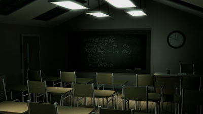
This week I have been experimenting with lighting again with my classroom scene, this time to create an atmosphere of an
eerie night. So far, from using my previously posted reference images, I have decided to use photometric lights with a greenish/blueish tint (filter) to create the desired effect. I have also made some slight adjustments from feedback I received during my presentation for artefact 1, such as the time shown on the clock, slight bump maps on the walls, consistent backgrounds shown through windows.
Here are some renders I have edited in After Effects and Photoshop, experimenting with different colour tints and saturation:
 |
| Experiment with green tint - highly saturated |
 |
| Experiment with green tint - desaturated |
 |
| Experiment with blue tint - highly saturated |
 |
| Experiment with blue tint - desaturated |
So far, I think that more desaturated versions tend to show an eerie/uncomfortable mood more successfully, and also think that the green tints work slightly better. However, I will probably post these pictures onto a quick survey again to ask some simple opinions on them.
In order to investigate the role of colour when creating mood, I will also include a version which is almost totally monochrome from desaturation, to see if colour makes any difference or is actually needed to create this type of atmosphere. I have looked at
film noir quite a lot during my initial reading into my research question, and this is a good example of how lighting can be used to enhance the atmosphere of the horror genre without any use of colour to influence this.
 |
| Experiment with hardly any colour saturation at all - Film Noir style |


No comments:
Post a Comment